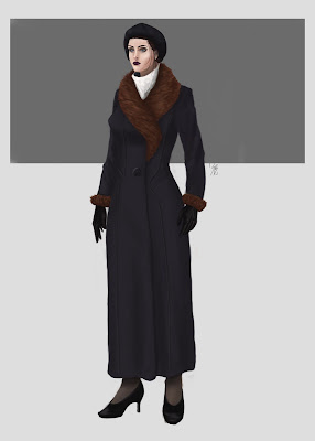
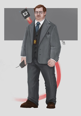
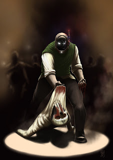
Right now I have been creating artwork for my portfolio to have both pieces I am proud of and as a way to practice my technique and skill before starting the project. Below are the three pieces I have done;

- Marco Polo -

- The Heretic -


- The Knight -
Pulp magazines are iconic for their bold and distinctive cover art. I want to be able to capture that style in some of my pieces in my project, so I did some studies trying to capture their fluid brush work;
Walter M.Baumhofer


Rafael DeSoto


Norman Saunders


I also tried to break down the composition in the covers;


Character Silhouettes:
I have started the designing process of my characters, starting with the main protagonist; Marty Marquis, the leader of the broadway squad:

With these designs I was trying to blend the 1930 / 40's fashion with the sci fi themes of the times.
I then went on to gather an idea of the character's face and how to bring out his hard-boiled, tough personality;

Before I started this face, I watched Anthony Jones' tutorial on character portrait drawings

This tutorial really help me refine my brush strokes, to think more methodically about how and why I am placing certain features, as well as the best way to use references. I do feel that this tutorial as helped me become more confident and improved my skill.

This is the final design of Detective Marquis' face, as I think it shows a more ruthless cop and the older face makes him seem more experienced in his field and may be the reason for why he is so unmoved by the somewhat questionable actions he takes to get the perpetrator.
Once I had a clear idea of how I wanted the main character to look I moved on to his right hand man Officer Berthold aka Big Johnny.
I went through the same design process as I did for Marquis, which can be seen below;

 As this character is a robot / android there were endless possible variants I could do, so I tried to do a smaller amount as it would mean I would have to think a lot more about what I wanted for my character, meaning my designs would feel much more refined from the start.
Once I got the designs down for Marquis and Big Johnny I created the final concept design piece showing the back and front of each character;


 After some feedback with my tutor there are some minor changes I need to do, just to make these final concept design paintings much stronger.

 As you can see from these images the feedback I gathered changed not only the actual art, from the way the body has more volume (especially in the robot) but the way they are presented on the page. I was told that the back views were unnecessary as there isn't really anything particularly important that needs to be shown off.


Once I got these silhouettes down I went on to try and narrow down the face / features of these characters;

 After some feedback, there are places where I can further push these designs to maybe create something much more original and stronger, but I personally feel that I have a design I like for both but I am going to try and push myself and see what else I can come up with.
This is the final concept I have come up with so far, if I come up with a stronger design for the face in the future it won't be to much hassle to change the final design here, but my main concern at the moment is getting all the characters done then I will look back over them and see what else I can push further.

Here are the final concepts for Miss Shaughnessey;

 I decided to do two one with her normal attire and another with her overcoat, After feedback with my tutor there are tweaks that need to be made to finish these pieces off which I will get to once I finish the last 3 characters.
 The advice I was given to make this character read better was to tighten her skirt up to be more of a pencil skirt rather than a loose flowing one, as well as touching up some of the shading around the chest area, to make the clothing feel more believable.
These are the silhouettes and face variants for Inspector McQuarie and Detective Derosier. McQuarie is the comic relief character and is quite clumsy, he is also the tech-guy who creates gadgets and robotics for the Broadway Squad. Derosier is a suave gentleman, who is more interested in getting ladies than getting the crook.
Asa Mcquarie:


Harry Derosier:


Harry Deorsier Final Concept:
This was the first one I made which has many faults, I was trying to create a lanky character but in doing so I made an oddly out of proportion human with an uncomfortable stance.


These are the silhouettes and face variants for the sadistic and cold blooded hired gun Al Corcoran.
I kept these silhouettes in the same colour scheme as Armand, as they are the two villainous characters I felt that they both should have primarily white outfits with black accents.


Al Corcoran Final Concept:
At first I went with the burnt face variant for the final concept but after talking to many of my peers and tutors they all felt that the one with the 'A' scar had more character and intrigue to it so I scraped the face and went with the 'A' scar. As you can see the burnt face wasn't the only thing weak with this character. Much like Harry Derosier the proportions were totally off


Once I had finalized all the concepts of the characters I moved on to creating illustration that help portray the characters personalities. It was also an exercise for me to help become better t composing scenes in a portrait orientation.
The first one I started with was Armand Dahloute. I wanted this character to look extremely imposing and menacing. Below was a thumbnail I did just to have a base understanding of what I wanted and allowed me to figure out some of the colour palette.


Next I moved onto a more light-hearted one with Harry Derosier. The idea for this one was to show him in the environment he is most comfortable in. The most debaucherous place closest to him.
Below is the quick thumbnail I made trying to figure out the positioning of the characters and what would be going on in the background, as well as the lighting.
 Below is a quick process of how I went about creating this piece.


McGuire was the next piece I moved on to which I had a lot of trouble with and feel that the final outcome was good but overall was the weakest one I made. The thumbnails again were all about me getting a rough idea of what I wanted to do with this piece. I wanted to show him and his robot sidekick investigating something showing how the two interact in the world.


Final Piece:
 There were quite a few changes I had to make to this piece which helped it out for the better. The main one being the pool of light on the floor which helped ground everything making items feel tangible, it also gave more context to the strong lighting on the corpse. Another main change I was advised on was bringing the robots blast trail infront of the character, making it my dynamic and draws you eyes upwards towards the actual robot.
Next was the main character Marty Marquis. I wanted this one to be oozing with a film noir atmosphere, as this character is your typical brooding, rough at the edges noir cop I felt having some very iconic noir lighting would be perfect for this character. I wanted the lights to be red and blue to add some interesting colours to the piece but to also allude to police sirens giving context to his office.


Keeping with the noir vibe I moved onto Miss Martha Shaughnessey whom I wanted her mysterious nature to come through:


Final Piece:

With Officer Berthold I wanted his brutish nature to shine through, how he is always ready for a fight, so I decided to do a almost batman-esque pose of him fighting some crooks. Below is the reference I used to get a base idea which by the end changed quite a lot.


Final Piece:
 The final piece only had some minor adjustments that needed tended to, to make it a more solid piece. I was advised to add some loose silhouettes in the background with some loose hints of flashes and lights, so it felt more of an underground fight club rather than a bar brawl. Also I blurred areas of Berthold and the thug that fade to darkness so that they feel more situated in the scene.
Al Corcoran was possibly the hardest one for me to decide on an idea as it kept changing constantly. I wanted to get across this ruthless killer but one who attacked from the shadows. I initally went with something that you can see below in the quick thumbnail. I went with it for a while getting somewhat far with this intial idea but in the end decided to scrap it as something wasn't sitting right with me.


My new idea was portraying the feeling of him striking from the shadows more, creating a much more atmospheric piece. Below is the rough thumbnail I created whilst I was planning it all out then a quick step by step process:


Final Piece:
 I made some minor tweaks to this which made a huge difference to the overall piece, the main one being the shading on the head. Previously the shading on the head looked like an odd haircut, and just by adding some softer skin tones around the tones it made it so much more believable. I also added water stains on the coat making this thick wool coat look like the water has seeped into it, placing the character more in the environment as well as some slight touches to the knife and gun.
Pulp Covers for Main Cover and chapter covers:
For the cover and chapter pages, I wanted to capture the pulp magazine feeling of the 1940's in doing so I research many covers of those time and put together a moodboard of just a few, primarily with the work of Walter Baumhofer as his work really spoke to me, but with these I wasn't just looking at the artwork but the type and arrangement of it all:
 While I was looking around at pulp magazines I found some modern ones for the comic The Black Beetle and The Spider by artist Francesco Francavilla. These were extremely inspirational to me as they had so much character and intrigue to them. The main thing I took from them were the strong, bold colour palette and the harsh graphical nature of them. The moodboard below is of some that spoke to me the most:

Main Cover:


 The tweaks for this were quite extensive, primarily around the face, using the liquify tool I had to re-mold the shape to make it more anatomically correct and to make it look more like the main character Marty Marquis.
Chapter 1 Cover:


Final Piece:
 The tweaks I made to this were extremely minor, I added a slight orange gradient to the background giving some more depth to the image and changed up the text of 'Created by John Lawerence Art by Sam Brooks' which is a change that will be made on all 3 covers so that they are consistent.
Chapter 2 Cover:
For this cover I wanted to make a homage to this cover by Baumhofer which was one of my favorite while I was researching. It also worked well with my protagonist and antagonist, instead of red skull with a green light, I went for the head of my villain which looks like a gold skull and purple light. The problem I faced was making the whit shirt still read as white under the purple light.
 Step by step process:


Final Piece:
 The edits I made to this piece was adding much harsher highlights to the shirt and face making the light seem a lot brighter as well as making the shirt look as if it actually is a white shirt under purple light. I also darkened parts of the face to push the highlights even more.
Adverts for final document:
The concept behind these adverts were to give some lore to the world and make it seem more tangible, as well as creating a nice break between each chapter in the book.


Self-Promotion:
Throughout this whole year I have been trying to brand myself as sambrooksart, creating many online media accounts as well as creating a logo for myself. I have gotten a couple of private commissions over the course of this project which has helped boost my confidence as well as made me able to work under extremely set conditions and more pressure which I felt comfortable in.
Conversation with Dambuster Studio Head Hazit Zala and the Art Directors giving me feedback on my portfolio and areas I can improve with links to resources I should look into.

My unsuccessful application for a summer internship at Jagex but I almost gotten to the interview but was unfortunately no let through to that stage.

Life Drawing this term:


I went through the same design process as I did for Marquis, which can be seen below;


Once I got the designs down for Marquis and Big Johnny I created the final concept design piece showing the back and front of each character;


I then started the design process for the next two characters, Miss Shaughnessey the femme fatale and Armand Dahloute the main antagonist.
I did the silhouettes for both first, trying to capture their style and fashion sense;


Once I got these silhouettes down I went on to try and narrow down the face / features of these characters;


This is the final concept I have come up with so far, if I come up with a stronger design for the face in the future it won't be to much hassle to change the final design here, but my main concern at the moment is getting all the characters done then I will look back over them and see what else I can push further.


These are the silhouettes and face variants for Inspector McQuarie and Detective Derosier. McQuarie is the comic relief character and is quite clumsy, he is also the tech-guy who creates gadgets and robotics for the Broadway Squad. Derosier is a suave gentleman, who is more interested in getting ladies than getting the crook.
Asa Mcquarie:


Mcquarie Final concept:


I was given a lot of helpful advice on this final concept, such as making the blast trail of the robot more opaque so it looks less like a solid object, as well as adding some bounce light on the character from the blast trail. On the character itself I made the suit flow better with his body trying to give the character some more volume, (which is what I was constantly struggling getting first time with each character) I also darkened the shadows to give more depth to the form.
Harry Derosier:


Harry Deorsier Final Concept:
This was the first one I made which has many faults, I was trying to create a lanky character but in doing so I made an oddly out of proportion human with an uncomfortable stance.


Again with feedback from my tutors I was able to make a much stronger piece that reads well and still keeps all the traits I originally wanted. The main problem with the original one is that the character was roughly 9+ heads high, which is unnaturally tall for a human (even a lanky one). The solution to my was to shorten his legs as they were greatly out of proportion to the rest of the body. That simple change drastically changed this character for the better.
These are the silhouettes and face variants for the sadistic and cold blooded hired gun Al Corcoran.
I kept these silhouettes in the same colour scheme as Armand, as they are the two villainous characters I felt that they both should have primarily white outfits with black accents.


Al Corcoran Final Concept:
At first I went with the burnt face variant for the final concept but after talking to many of my peers and tutors they all felt that the one with the 'A' scar had more character and intrigue to it so I scraped the face and went with the 'A' scar. As you can see the burnt face wasn't the only thing weak with this character. Much like Harry Derosier the proportions were totally off


Once I had finalized all the concepts of the characters I moved on to creating illustration that help portray the characters personalities. It was also an exercise for me to help become better t composing scenes in a portrait orientation.
The first one I started with was Armand Dahloute. I wanted this character to look extremely imposing and menacing. Below was a thumbnail I did just to have a base understanding of what I wanted and allowed me to figure out some of the colour palette.


Final Piece:

Next I moved onto a more light-hearted one with Harry Derosier. The idea for this one was to show him in the environment he is most comfortable in. The most debaucherous place closest to him.
Below is the quick thumbnail I made trying to figure out the positioning of the characters and what would be going on in the background, as well as the lighting.


Final Piece:

There were quite a few changes I made to this before I was completely finished with it such as adding more definition to the silhouette of the legs and making the main character much larger making him more of the focal point.
McGuire was the next piece I moved on to which I had a lot of trouble with and feel that the final outcome was good but overall was the weakest one I made. The thumbnails again were all about me getting a rough idea of what I wanted to do with this piece. I wanted to show him and his robot sidekick investigating something showing how the two interact in the world.

I played around with adding


Final Piece:

Next was the main character Marty Marquis. I wanted this one to be oozing with a film noir atmosphere, as this character is your typical brooding, rough at the edges noir cop I felt having some very iconic noir lighting would be perfect for this character. I wanted the lights to be red and blue to add some interesting colours to the piece but to also allude to police sirens giving context to his office.

Small step by step process of making this piece


Final Piece:

The only change I had to do with this was to make the lights hitting the wall more opaque so it makes he light hitting the character much brighter, as well as changing the levels of the whole piece as although on my cintiq and laptop the darker piece looked fine. But on other devices such as my phone and my peers mac-book it was almost indistinguishable as to what was going on in the scene so brightening it was my only option, I tried not to brighten it too much as I wanted to keep that dark, solitary feeling to the piece.
Keeping with the noir vibe I moved onto Miss Martha Shaughnessey whom I wanted her mysterious nature to come through:

Here are my step by step which shows some of the process of creating this illustration:


Final Piece:

Talking to my tutors there were only minor changes I needed to make but they made a huge difference to the overall piece. The main one being the slight changes on the face, from making the highlight on the chin much more prominent and making her eyebrows much more expressive all helped really push this character.
With Officer Berthold I wanted his brutish nature to shine through, how he is always ready for a fight, so I decided to do a almost batman-esque pose of him fighting some crooks. Below is the reference I used to get a base idea which by the end changed quite a lot.

The piece started off with a Deco background as I wanted it to feel that they were fighting in on of the gang owned night club. I wasn't really feeling the two silhouettes in the foreground as they felt oddly out of place, yet I couldn't figure out what to do to keep it feeling like a brawl in action not the aftermath.

After discussing my thoughts with my tutor, he helped me figure out how to make a much more dynamic feeling piece and added a lot more atmosphere to it.

Final Piece:

Al Corcoran was possibly the hardest one for me to decide on an idea as it kept changing constantly. I wanted to get across this ruthless killer but one who attacked from the shadows. I initally went with something that you can see below in the quick thumbnail. I went with it for a while getting somewhat far with this intial idea but in the end decided to scrap it as something wasn't sitting right with me.


My new idea was portraying the feeling of him striking from the shadows more, creating a much more atmospheric piece. Below is the rough thumbnail I created whilst I was planning it all out then a quick step by step process:


Final Piece:

Pulp Covers for Main Cover and chapter covers:
For the cover and chapter pages, I wanted to capture the pulp magazine feeling of the 1940's in doing so I research many covers of those time and put together a moodboard of just a few, primarily with the work of Walter Baumhofer as his work really spoke to me, but with these I wasn't just looking at the artwork but the type and arrangement of it all:


Main Cover:

Step by step process


Final Piece:

Chapter 1 Cover:


Final Piece:

Chapter 2 Cover:
For this cover I wanted to make a homage to this cover by Baumhofer which was one of my favorite while I was researching. It also worked well with my protagonist and antagonist, instead of red skull with a green light, I went for the head of my villain which looks like a gold skull and purple light. The problem I faced was making the whit shirt still read as white under the purple light.


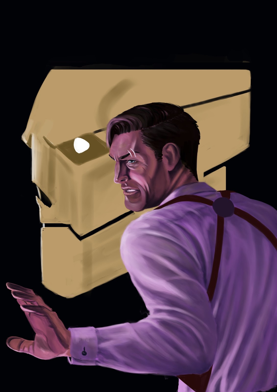


Final Piece:

Adverts for final document:
The concept behind these adverts were to give some lore to the world and make it seem more tangible, as well as creating a nice break between each chapter in the book.


Self-Promotion:
Throughout this whole year I have been trying to brand myself as sambrooksart, creating many online media accounts as well as creating a logo for myself. I have gotten a couple of private commissions over the course of this project which has helped boost my confidence as well as made me able to work under extremely set conditions and more pressure which I felt comfortable in.

Conversation with Dambuster Studio Head Hazit Zala and the Art Directors giving me feedback on my portfolio and areas I can improve with links to resources I should look into.


Life Drawing this term:


No comments:
Post a Comment