For my studio I want to take a short story, primarily a short horror or thriller story and adapt into concept art for a game, much like the book 'The Skillful Huntsman' by Scott Robertson and Mike Yamada.
First I need to look for a short story to adapt and use as my base narrative. I will be looking into Penny Dreadfuls which were short Victorian tales usually involving murder and the supernatural, as well as American Gothic stories to find a narrative that I feel inspired by.
After scouring the internet I could not come across many Penny Dreadfuls to read and see if they would work for my project. The ones I did manage to find were overly long for what I wanted and didn't really grab my attention as much as I thought they would.
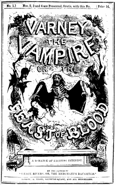
The only one I could find was Varney the Vampire and it just didn't have what I was looking for, as well as being more of a novel than a short story.
I then looked into American Gothic stories, I looked at some of H.P Lovecraft's short stories, The Outsider in specific. Yet this book was far to involved with the supernatural and didn't really have any characters that interested me or locations. Edgar Allan Poe on the other hand and several stories that interested me such as The Masque of the Red Death, yet it was much to short and was lacking in characters. The other one was The Mystery of Marie Roget which was one of the first detective stories written, unfortunately the story was lacking in exciting areas and had too few characters.
.tif/lossy-page1-800px-The_dagger_dropped_gleaming_upon_the_sable_carpet_-_Harry_Clarke_(BL_12703.i.43).tif.jpg)

(Masque of the Red Death Illustration)
But the idea of a Dectective story stuck with me so I started looking around for short detective stories and came across Pulp Magazines. "Pulp magazines (often referred to as "the pulps") are inexpensive fiction magazines that were published from 1896 through the 1950s...Pulps were the successors to the penny dreadfuls, dime novels, and short fiction magazines of the 19th century. Although many respected writers wrote for pulps, the magazines were best known for their lurid and exploitative stories and sensational cover art." (https://en.wikipedia.org/wiki/Pulp_magazine)
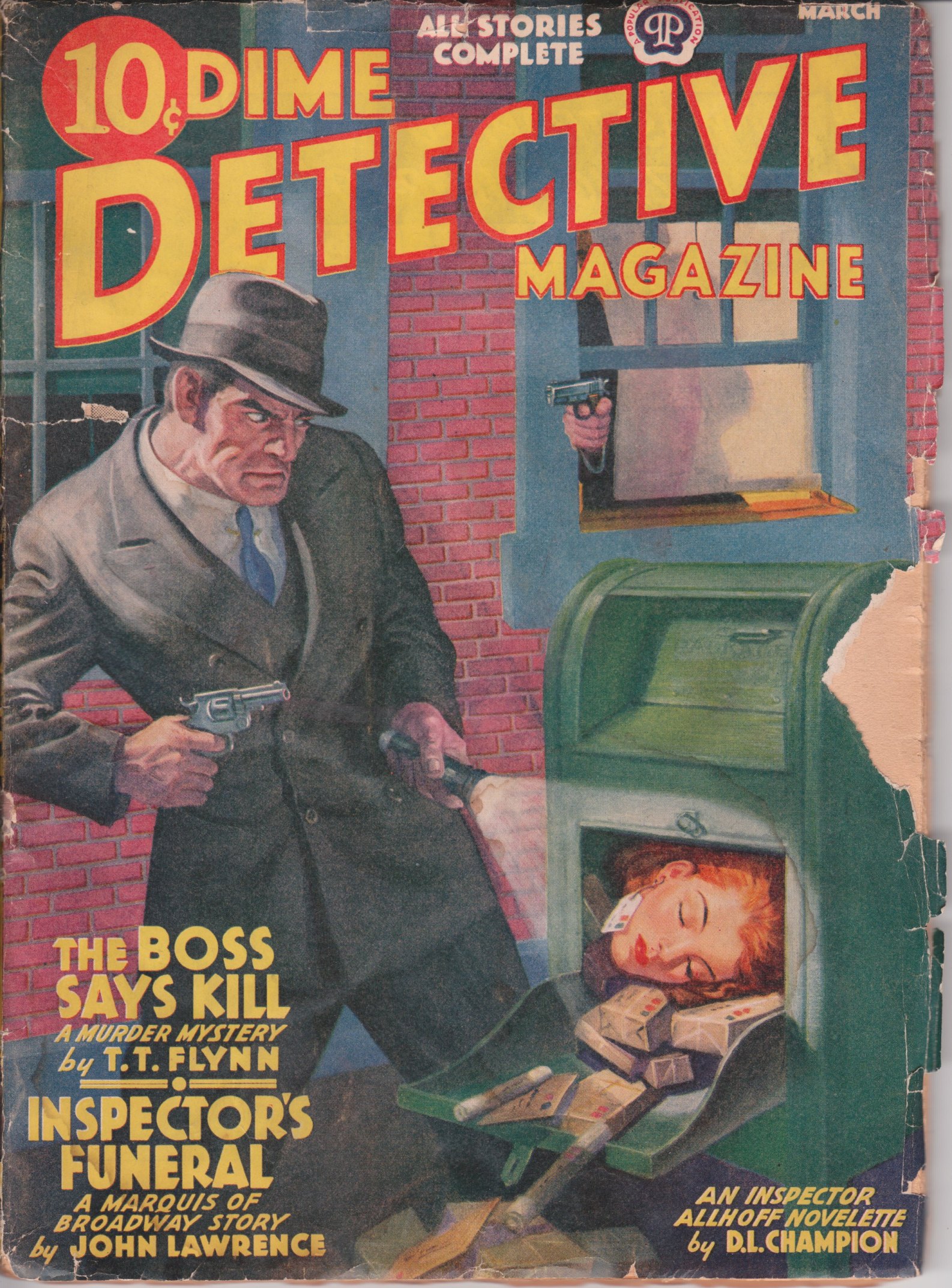
The 2 main pulp magazines I looked at were Strange Detective Mysteries and Dime Detective.
I read a couple of stories from each:
Strange Detective Mysteries:
Tomb for the Living Dead: Much too short far too little characters and only one main environment as well as the story being a bit lackluster.
School For Slaughter: Much better character interesting premises with a killer attaching small bombs onto people yet the environments didn't have much diversity.
The Corpse Clinic: Interesting premises and characters more variation in environments. This one is a possibility, also for this one and School for Slaughter I liked how both were set in winter as I feel snow and melting snow would add some character to the environments as well as emphasizing the cold, dreary atmosphere of the city.
The Crystal Doll Killings: This story was set on a ski lodge in the mountains so I was against it as I wanted a city setting.
Dime Detective:
For this I looked into one recurring character called Marty Marquis and his Broadway squad as I like the idea of a group much like 'The Untouchables' and how he is this tough as nail cops who gets the job done any way he sees fit.
Natural Killer: This story had some interesting and varied locations such as a run-down bar run by some weasely gangster. Yet this story was quite convoluted and hard to follow.
Live Man Shoe's: This story was quite interesting as it starts off with someone wearing prosthetics makeup to look like Marquis and frames him for murder. The killer also hides in the shadows and wears a black mask when he tries to kill Marquis. The only downside is the lack of exciting environments and not that much variation in characters.
Death in Round Numbers: This is the most engaging one in terms of character and environment variation, from the aristocrats to the rugged Detectives. The high class Club 44 to the dingy back alleys of New York. It also has an interesting story on top of that.
For all of these stories it was quite hard to follow as some of the writing is quite dated and made these tales a lot more confusing than they'd be had they been written now. But in conclusion I am going with Marquis of Broadway and the Death in Round Numbers story in particular.
- Week 4 -
Now that I have my story, I decided to look into the fashion of the time period it was written 1930's - 1940's and noir movies of that time as around then Film noir was primarily Detective stories.
I made a few mood-boards showing some of the fashion and hair styles:


Most men around this time had little to no facial hair, not even a 5 o'clock shade


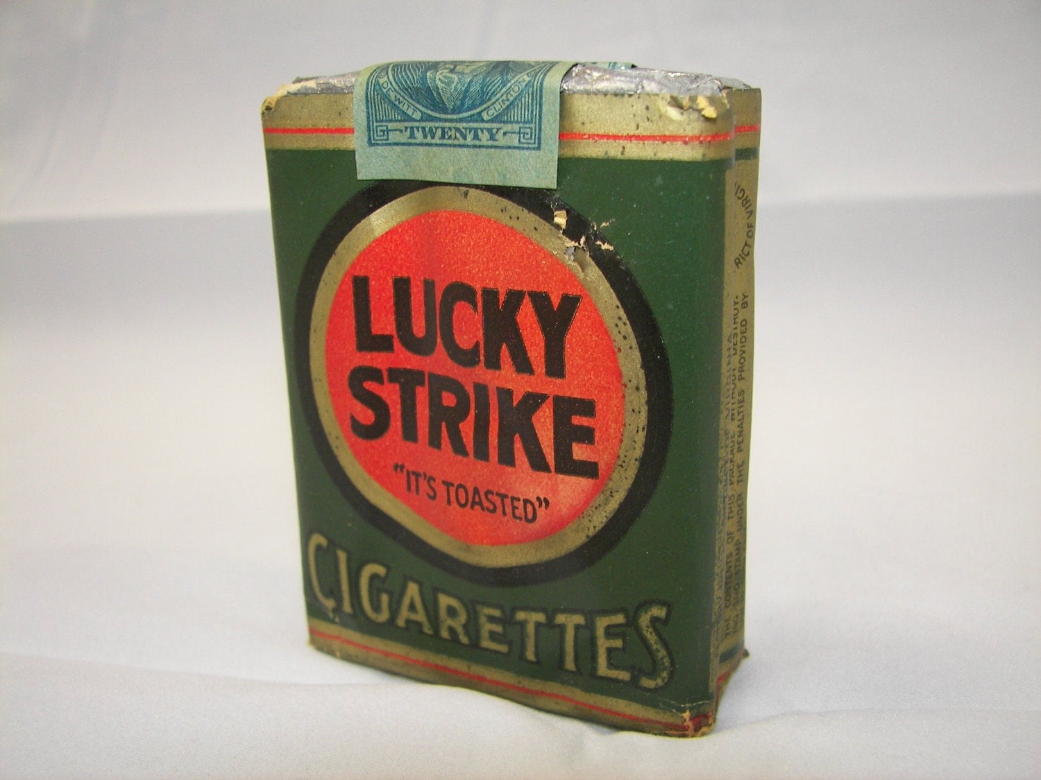
I then started to look into the most popular cigarettes around that time as most of the characters in this story smoke so I wanted to stick close to realism, in the case of the design and colours of the cigarette boxes. I found out that the main cigarettes of the late 1930's early 40's were; Pall Mall, Chesterfield and Lucky Strike. The advertisements also gave me more of an understanding of the style of that era


Information about some of the popular clothing of the time and mentioned a lot in the story:
Chesterfield Coat: is a long, tailored overcoat. It arose along with the lounge suit as an alternative to the highly shaped coats it replaced, such as the frock overcoat
with its heavy waist suppression using a waist seam. The Chesterfield
has no horizontal seam or side bodies, but can still be somewhat shaped
using the side seams and darts. It can be single- or double-breasted,
and has been popular in a wide variety of fabrics, typically heavier
weight tweeds, or charcoal and navy, and even the camel hair classic. It has often been made with a velvet collar. These variations make it extremely versatile, so it can be worn with a city suit or even semi-formal dress, as well as casual sports jackets. It was a staple of smartly dressed men's wardrobes from the 1920s to 1960s, and is still very commonly worn.
(https://en.wikipedia.org/wiki/Chesterfield_coat)

Princess Coat: Primarily made out of wool or other heavy materials with a fur collar. Nipped-in waist with a flaring skirt

Fedora: is a felt hat with a wide brim and indented crown. It is typically creased lengthwise down the crown and "pinched" near the front on both sides. Fedoras can also be creased with teardrop crowns.

The core traits of noir are;
unsettling narrative themes of ambiguity and
violent death, certain stylistic characteristics immediately
come to mind when discussing film noir. Stark, angular shadows. The isolated feel of modern cities.
Conflicted anti-heroes and terse dialogue. Determined, beautiful,
scheming women.(http://www.cindytsutsumi.com/wp-content/downloads/words/Film_Hist_40s_FilmNoir/fn/fn_c.html)
Below are moodboards with screen-caps from Noir movies around 1930 - 40's;


The strong use of shadows and contrasting light create an incredible atmosphere.
I started to look into modern noir-esque movies, the first I looked at was A Girl Walks Home Alone At Night, the moodboard below shows a couple screen-caps from the movie which I felt showed a strong essence of Noir not just in the aesthetics but because of the tension it emotes as well as the loneliness. The movie was a vampire movie yet it was not a horror or your typical monster movie, It felt more like a western at times, then a thriller and then a romance. It was this great collide of genres with the added noir style which I felt create an extremely interesting movie.

Not only does the movie have this Noir aesthetic but it is also carried through into the spin off graphic novel which gives more depth to the girl character (the vampire). Below are some images from the graphic novel:

I then looked at some more neo-noir movies, I was primarily looking at the style of the movies and how they can portray the noir mood through cinematography, which would help me with my illustrations.
Drive:

Drive is a neo-noir movie, although not black and white like most noir movies. Drive has the embodiment of one through its ambiance and tone. Drive also contrasts colour much like how noir contrasts the dark blacks with the bright whites, Drive on the other hand contrasts the bright neon like colours with the dark shadows.
Sin City / Sin City: A Dame to Kill For

The Sin City movies by Robert Rodriguez does the comic fans a lot of justice in this faithful adaptation, where some scenes are pretty much one to one recreations of the comic panels. As well as the faithful recreation the also kept the colour pallete from the comics which creates this highly stylized noir film, with a lot of play and good use of shadows.
The Dark Knight Trilogy:

Christopher Nolan not only made the best Batman films to date, he created it in this noir world which Batman fits so well. The cinematography in this film is stunningly beautiful which is surprising as they were your blockbuster superhero movies. It just shows that noir can potentially be portrayed through all genres
- Week 5 -
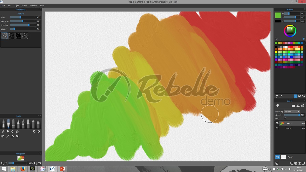
I've been looking into alternate painting software and software which could aid my paintings. The first one I found and experimented with is Rebelle by Escape Motions, which focuses on watercolour and acrylic paints. The pictures below show my experiments;

Watercolour brush
Acrylic brush

Pastel brush

Pencil brush

Pen Ink brush

Marker brush

Airbrush brush

Showing how you can change the paper type

Showing how you can tilt the canvas and the wet paint will drip in that direction

Incorporating most of the elements to create a quick image to see how well it works
The other program I was experimenting with was SketchUp to see how quick and well I could block out some environments:


SketchUp was somewhat simple to use, it seems like it's easy to pick up but hard to master and I could not find how to change the lighting, it is not as user friendly as I would of liked but I am going to spend some more time with it and see how much more I can improve.
- Week 6 -
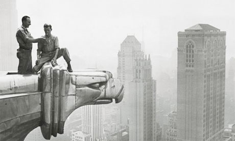
1930 / 1940 New York City
This research was to get an idea of what New York looked like during the 30s and 40s, surprisingly not much has actually changed. Just some more skyscrapers with more modern designs. But the Art Deco style is very prevelant in these images as this art movement was highly popular then.

Sci-Fi in the 1930s / 40s as well as ideas of the future

- Black Canvas experiments -


Study from the book 'Framed Ink'

Images highlight are the ones I studied from

- Thumbnail Practice -
For these thumbnail practices I was using the work by artist Sparth as my main source of reference to start getting a good composition and then added my own personal touch, these practices / studies have been extremely helpful in boosting my confidence of creating environments


- Brazil Screen-caps -

- Week 7 -
Art Deco is an influential visual arts design style that first appeared in France just before World War I and began flourishing internationally in the 1920s, 1930s and 1940s before its popularity waned after World War II. ( https://en.wikipedia.org/wiki/Art_Deco )
Deco is quite a bold design with use of parallel lines and symmetrical geometry, and is instantly recognizable. The main traits of Deco are; geometric forms: spheres, polygons, rectangles, trapezoids, zigzags, chevrons, and sunburst motifs. Elements are often arranged in symmetrical patterns. Modern materials such as aluminum, stainless steel, Bakelite, chrome, and plastics are frequently used. Stained glass, inlays, and lacquer are also common. Colors tend to be vivid and high contrast. ( https://en.wikipedia.org/wiki/Art_Deco )


A mural inside the building

Letterbox inside the building.

Another famous building in New York which is highly influenced by Art Deco is the Chrysler Building which finished construction a year before the Empire States in 1930. I personally think this building is one of the finest looking buildings ever

One of my personal favorite parts of this building are the highly stylized gargoyles which pours character into the Chrysler
I want to capture the Art Deco essence in my alternate New York City to boost the mood of the artwork and would add as a great backdrop for the characters I will create.
I tried creating some Deco patterns as they will play a vital role in giving personality to my designs


- Week 8 -
I have been prating my fundamental draftsmanship to be able to be more confident in my line making. Using simple exercises such as drawing circles and analyzing them as I'm drawing to see how I can improve, I also did straight line practices and curve practices. I will be doing these everyday before every drawing I do.
(Place photos of draftsmanship practice)
I have bought many tutorials by Anthony Jones as his way of explaining how to work resonates with me, in his tutorial Painting with Confidence he was talking about starting with blocking out you characters as it will create good clean edges, so I have practiced to create shapes without lifting my brushes to draw and fill in these shapes to practice my edge control


I also tried to start visualizing my alternate New York City by creating some rough thumbnails 2 of which are extremely rough, the last one being much more refined


- Week 9 -
These are studies / practices trying to capture Benedict Wallace's style as I love his work and feel taking aspects of this into my designs will make them much stronger.
Step 1 - Figure out the base colour and create the silhouette

Step 2 - Add highlights to give form to the silhouette

Step 3 - Add the small details such as the lines on his helmet and the lines on her leg

Final Step - Add the shadows and neaten up any thing rough

These are the images I practiced from (my practices are the larger ones and the smaller ones are the original)


I have also started creating my Design Document which has been quite the learning curve as I have had to pick up InDesign, which I have never used before but I feel I have gotten the hang of it quite quickly. Below are just a few pages including the Title Page showing the main over arching thing of Art Deco which I wanted to incorporate into my document to give it the 40's feel.


- Week 10 -
I have started doing material studies in preparation for my concepts, I have been focusing on materials that will be common in my designs


After talking with my tutor about my worries of my research just being at face value he gave me some interesting avenues to investigate:
- Anti Heroes
- How to visualise Moral Ambiguity
- Optical illusion paintings
What makes an Anti Hero?
'An anti-hero is unorthodox and might flaunt laws or act in ways
contrary to society’s standards. In fact, and this is important, an
anti-hero often reflects society’s confusion and ambivalence about
morality, and thus he can be used for social or political comment. While
an anti-hero cannot slip into a white hat, he will always:
- have the reader’s sympathies, although sometimes his methods will make this difficult.
- have easily identified imperfections.
- be made understandable by the story events, meaning that the reader will come to know his motivations and likely will be privy to his inner demons.
- have a starring role in the story.' (http://www.writersdigest.com/qp7-migration-books/bullies_excerpt)
'If your character is lawless, rebellious, or obnoxious, it is likely that your character will somehow justify these behaviors.' (http://www.writersdigest.com/qp7-migration-books/bullies_excerpt)
The ways in which Marty Marquis justifies his questionable actions is that he catches the crook and continues to protect the citizens of New York City. Anti Heroes not just people that go around doing whatever they please, they normally have a moral code which they will not cross, such as they will never kill.
Some more traits that anti heroes may have:
(Traits in bold can be relevant to the actual design of the character)
- 'are sometimes unglamorous and unattractive in character as well as in appearance.
- can be motivated by self-interest and self-preservation, but there is usually a line anti-heroes won’t cross, which sets them apart from villains.
- often have motives that are complicated and range from revenge to honor.
- forced to choose between right and wrong, will sometimes choose wrong because it’s easier.
- can play both sides with good guys and bad guys, profiting from both.
- can sometimes be coerced to help underdogs, children, or weaker characters, and they sometimes do so voluntarily.
- can embody unattractive traits and behaviors, such as sexist and racist attitudes, and violent reactions when wronged.
- can show little or no remorse for bad behaviors.
- are usually a mess of contradictions.' (http://www.writersdigest.com/qp7-migration-books/bullies_excerpt)
Mad Max

John Constantine

Max Payne
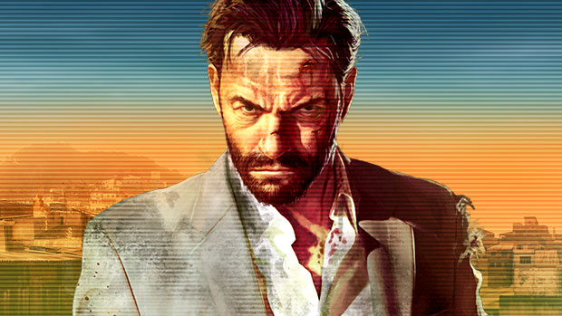
The Punisher

Joel (The Last of Us)
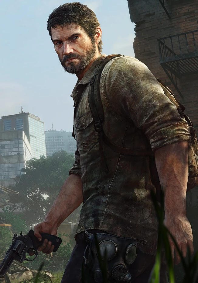
Each of these characters have common characteristics and backgrounds, each of them lost their family in varieties of ways but mainly someone killing them. This lost is what sets them on their path trying to claim vengence. Batman in some renditions can be a anti hero yet there are more renditions of him being more of a hero rather than an anti hero but he is walking a thin line.
These characters are normally quite selfish as well yet as their story continues they become less and less selfish. Below are is an interesting look at the comparasions between a hero and an anti hero and show much clearer how these characters fit into the role of the Anti Hero:
- 'A hero is an idealist.
- An anti-hero is a realist.
- A hero has a conventional moral code.
- An anti-hero has a moral code that is quirky and individual.
- A hero is somehow extraordinary.
- An anti-hero can be ordinary.
- A hero is always proactive and striving.
- An anti-hero can be passive.
- A hero is often decisive.
- An anti-hero can be indecisive or pushed into action against his will.
- A hero is a modern version of a knight in shining armor.
- An anti-hero can be a tarnished knight, and sometimes a criminal.
- A hero is motivated by virtues, morals, a higher calling, pure intentions, and love for a specific person or humanity.
- An anti-hero can be motivated by a more primitive, lower nature, including greed or lust, through much of the story, but he can sometimes be redeemed and answer a higher calling near the end.
- A hero simply is a good guy, the type of character the reader was taught to cheer for since childhood.
- An anti-hero can be a bad guy in manner and speech. He can cuss, drink to excess, talk down to others, and back up his threats with fists or a gun, yet the reader somehow sympathizes with or genuinely likes him and cheer him on.' (http://www.writersdigest.com/qp7-migration-books/bullies_excerpt)
Shape Theory in Character Design
Break down any character and they will become basic shapes, such as circles and triangles. These base shapes are extremely important as they ditacte how people will percive these characters, 'shape has a way of communicating universally, because the concept of circular versus triangular shapes originatevery much from nature. Rounded shapes tend to be safe, while angular shapes make us cautious.' (https://www.diva-portal.org/smash/get/diva2:637902/FULLTEXT01.pdf)

Circles
'Curved and circular shapes are considered the friendliest as they have no sharp or dangerous corners. Circular shapes in nature has a tendency of being soft and harmless and evoke likable characters. Many of the most well-known protagonists are designed around circular concepts'. (https://www.diva-portal.org/smash/get/diva2:637902/FULLTEXT01.pdf)
Characters such as Mario and Mega-man are designed around circles.
.png)

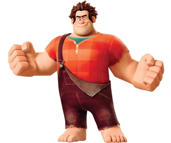
Squares
'Square-like shapes relate to straight vertical and horizontal lines that communicate strength,stability and confidence. Squares can both be large and daunting or comforting and clumsy. They often depict steadfast characters who are dependable and are commonly used for superheroes or the heavy.' (https://www.diva-portal.org/smash/get/diva2:637902/FULLTEXT01.pdf)
Characters such as Superman and Wreck-it Ralph are designed around squares.
Triangles


'Triangles relate to diagonal and strong,angular lines and are the most dynamic of the three shapes. Bad guys and villains are often based upon dominant triangular concepts, as they appear malicious,sinister and communicate with the most aggression...It is the circle's most opposing shape and often used for antagonists.' (https://www.diva-portal.org/smash/get/diva2:637902/FULLTEXT01.pdf)
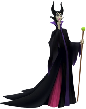
Characters such as Sauron and Maleficent are designed around triangles.

Making characters into simple shapes


I took the idea that each character is based around a shape and applied that to these images, by abstracting them to a core shape.
'One of the most common theories in design is that form must follow function,
and this applies to all areas including character design. A character
with a logical, clearly understandable form is more easily perceived and
understood by the human brain. Simple shapes like circles or ovals
often work best as the wireframe for a character because of their
versatility and visual straightforwardness.' (http://blog.inkydeals.com/basic-principles-for-great-character-design/)
After looking into shape theory I started investigating what makes good character design, to further push my concepts. I have read articles, watched tutorials and other videos on this topic.
Below are excerpts from the resources I have used.
Principles of Design- Characters
By Daneian
'Since every person is a combination of traits both physical and mental, an author must fully understand who their character is, what it wants and what it will do to get it. Successfully building a character completely depends on implementing the thousands of ways which everybody communicates information about who they are, even when their mouths aren’t moving. This information is characterization and every bit reveals history.'
'Functional design communicates a character’s proficiency and relays characterization, it also sets our expectations.'
(http://www.giantbomb.com/profile/daneian/blog/principles-of-design-characters/94418/)
Preliminary Sketches of my Character using shape theroy:


After some feedback from my tutor I tweaked the shape of the legs on the last character and I feel it has improved the silhouette:
Original Silhouette


While filling my design document up I had to create another quick environment thumbnail to get a feeling of the city my characters will be inhabiting

During one of my feedback sessions my tutor and I decided that I should experiment with photo-bashing to create quick visualizations of the city my characters will inhabit. For a first go at photo-bashing I am quite happy with the outcome.


Whilst designing my Design Document a tutor of mine gave me some feedback on how I can improve my background / cover page. I was advised to add a light gradient to it, to emphasize the Deco feeling to it as well as giving it some needed depth:
Original:

Tweaked Image:

I have done some quick experiments trying to create a vintage film grain feeling on my paintings
The images below show attempts at achieving a old film feel:
No Filter

Variety of filters:
The two images below may be too distracting as the scratches and marks are quite prominent, yet they do give the painting the vintage feeling.


This filter makes the image look too washed out

This filter I thought was very effective with the slight brown tinge gives the image a slight warmth


All the filters together.

Below are all the life drawings I did this term with a short description explain what the purpose was for them:
Session One
For this first session I was just getting back into life drawing so I dd quick line drawings for the poses then for the longer pose when into more detail with values.


Session two:
As we didnt have a model for this session we drew the skeleton for a while which was quite tasking then we drew each other and I used white chalk on black paper to focus on creating a noir-esque feel, it is also helping me understand how to visualize strong values

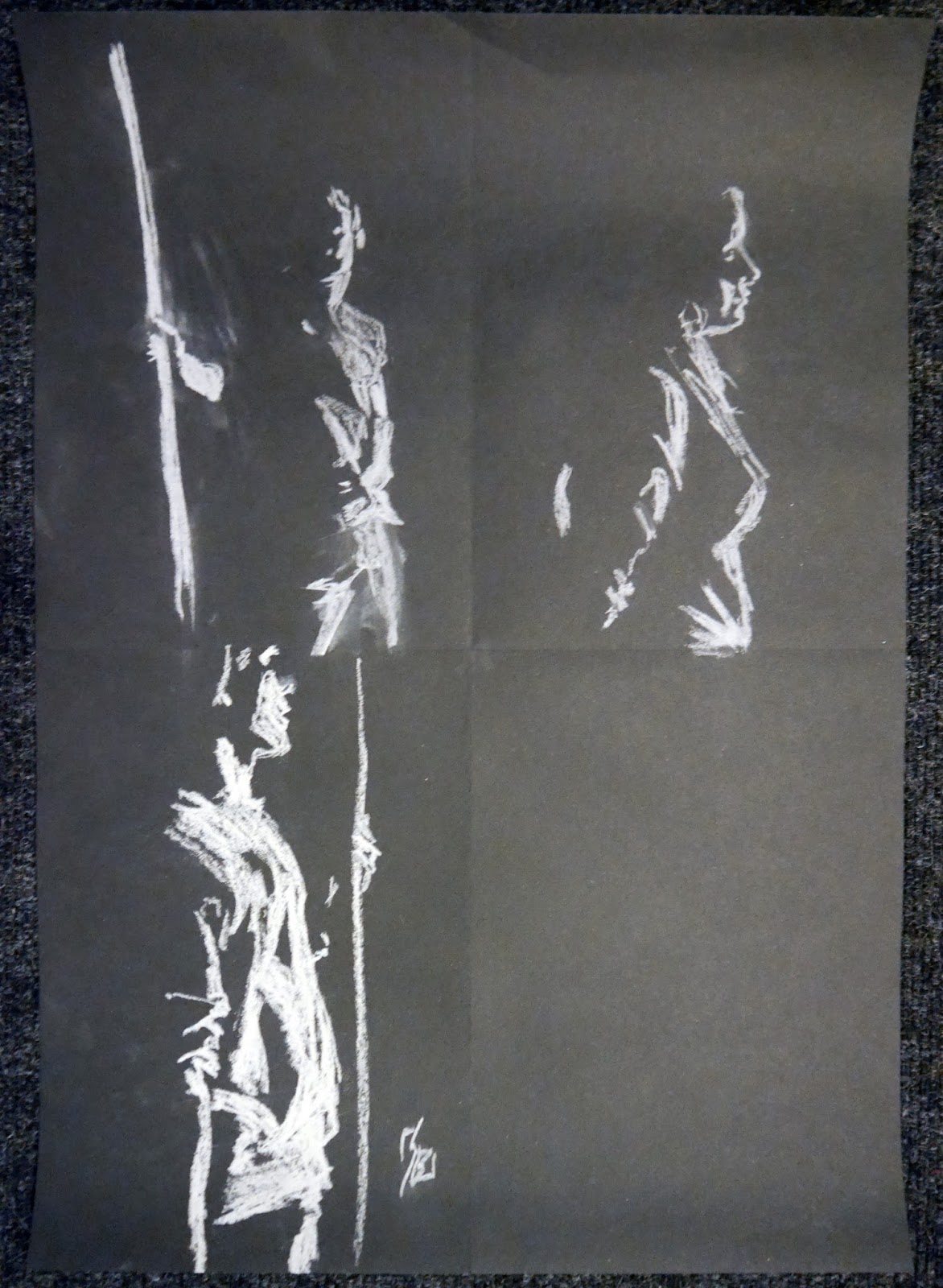


Session Three:
Further my practice of white on black, trying to create more atmosphere in my quick pose pieces


Session Four:
Like the sessions before I was focusing on using white chalk on black sugar paper below are the quick poses then a longer pose where i was able to get more detail


Session Five:
At the start I did my usual white chalk on black sugar paper for our quick warm up poses to further my practice using bold values


Then we started focusing on foreshortening which was quite hard to wrap my head around as you have to really accentuate parts of the body.


Final Session:
This was a long pose where I used paint still using black and white, I started with no line work and was encouraged to just paint and was extremely pleased with the results.
